Forbes @ 100: How the brand's logo changed over a century
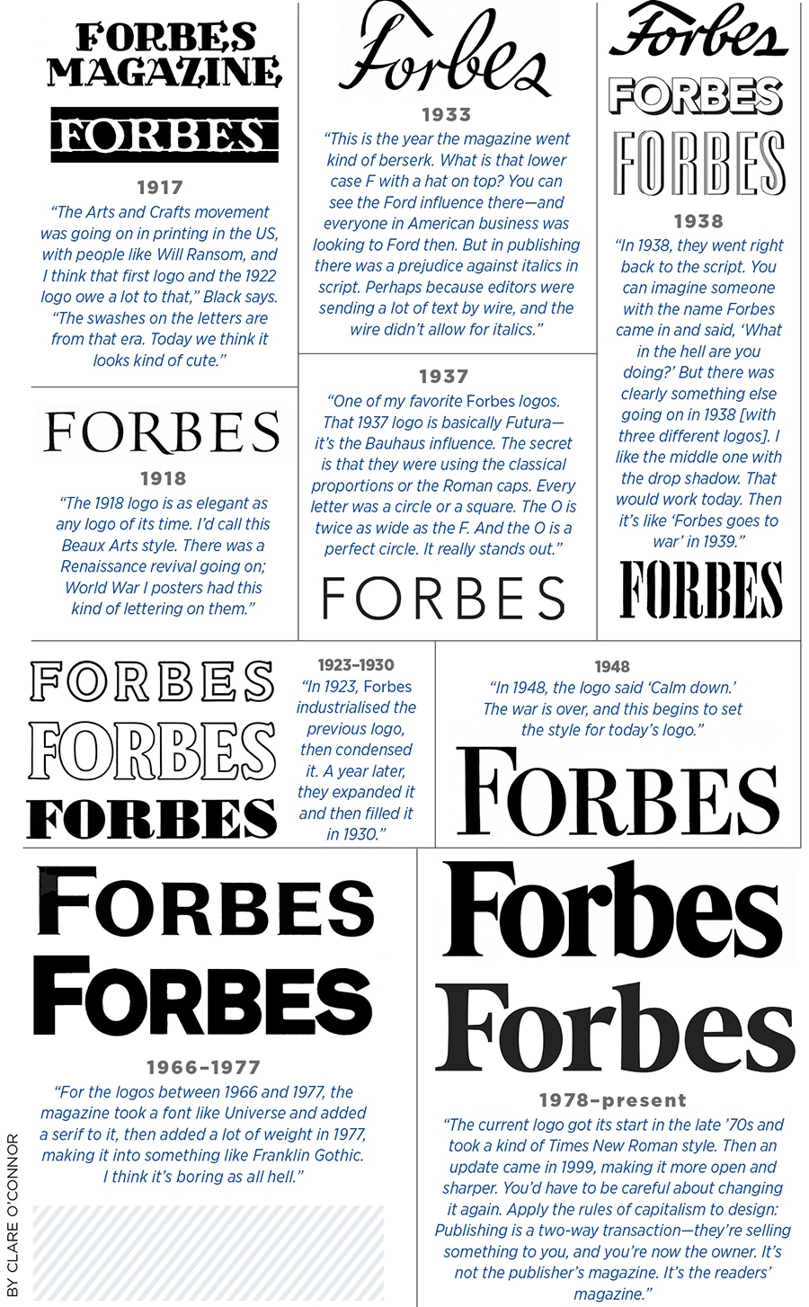
Forbes logo's evolution, annotated by a typography legend
A magazine’s logo is its identity, beckoning the reader from the newsstand—or mail pile. In the case of Forbes, it also represents three generations of family stewardship. So what’s in a name? Forbes asked legendary art director Roger Black—a co-founder of the Font Bureau who has designed (and redesigned) countless magazines, including Rolling Stone and Esquire—to evaluate 100 years of Forbes typography, from pre-war swashes to post-millennial serifs.

(This story appears in the 30 November, -0001 issue of Forbes India. To visit our Archives, click here.)
X


