How 'warming stripes' became the new symbol of global warming
These stripes look like a barcode, comprised of lines that turn increasingly red from left to right. Here's a look at where they come from and what they mean
 'Warming stripes' have become the new symbol representing global warming. 'Warming stripes' have become the new symbol representing global warming.
Image: Ed Hawkins / University of Reading
You've probably already seen them on a placard at a climate march, on television on a US senator's badge, at Fashion Week or even on a soccer player's jersey. Now famous, these so-called 'warming stripes' have become a new symbol to represent global warming. So where do they come from and what do they mean?
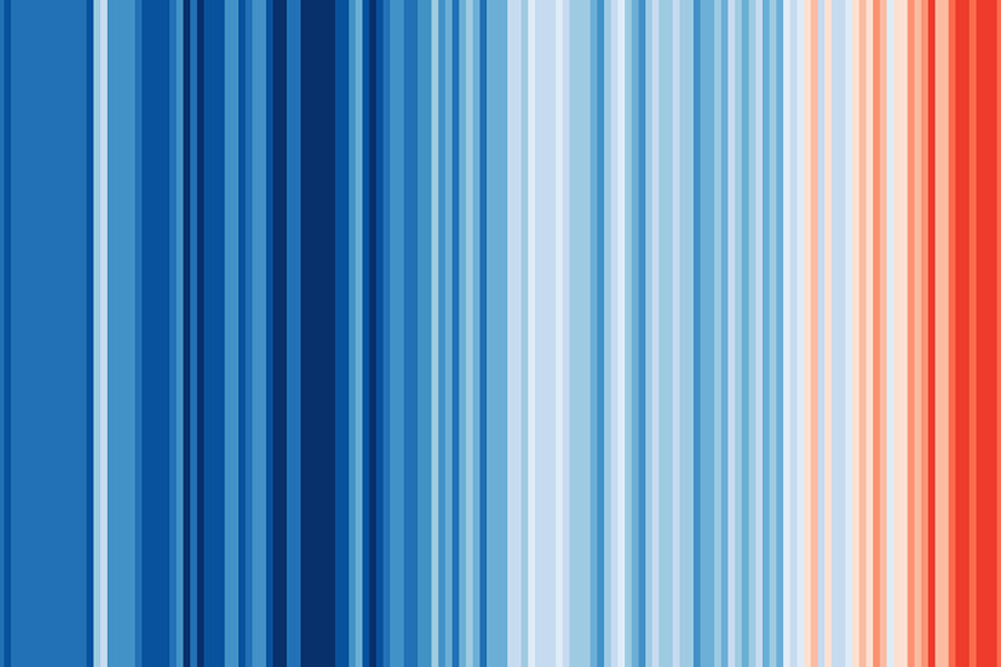
These stripes look like a barcode, comprised of lines that turn increasingly red from left to right. The so-called 'warming stripes' have gained significantly in popularity and are now considered one of the most widespread symbols of global warming. And this graphic representation is based on serious stuff, since it was designed by British climatologist Ed Hawkins, a professor at the University of Reading. The scientist, who also co-authored the last two IPCC reports, designed these 'climate stripes' in 2018, purposely leaving out words and numbers. "Just a series of vertical colored bars, showing the progressive heating of our planet in a single, striking image," explains Ed Hawkins on the University of Reading website.
The objective of these 'climate stripes' is to illustrate in a clear and striking way how average global temperatures have increased over nearly two centuries. It starts in the 1850s, with blue stripes represented on the far left of the image, and continues until the 2010s. Each band represents the average temperature of a given year, relative to the average temperature of the period as a whole. Shades of blue indicate colder years, while red indicates warmer years. "The stark band of deep red stripes on the right-hand side of the graphic show the rapid heating of our planet in recent decades," states Ed Hawkins.
Since its creation in 2018, the warming stripes graphic has spread like wildfire. It is now seen everywhere, whether on the cover of the new book by Greta Thunberg, on the jerseys of the English city of Reading's soccer team, at London Fashion Week or elsewhere. Brands have also been quick to seize upon the image. Now, warming stripes are widely deployed on merchandising items like mugs, T-shirts, pin badges... and even masks! While some people might view this marketing appropriation as greenwashing, it can also be argued that the democratization of this symbol is helping to anchor the climate crisis in people's minds.


