
'Paris has made the Olympics cool again'
Grégoire Weil and Chloé Thomas of W Conran Design talk about designing the Look of the Games, encompassing inclusivity and sustainability, and creating a legacy that lasts beyond four weeks
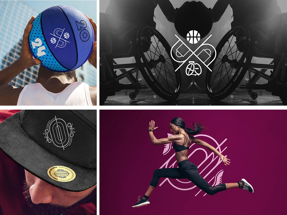 Branding and design for Paris Olympics 2024
Four years ago, while the world was reeling under the Covid-19 pandemic, the design and branding team at W Conran Design was meeting the Olympic Games organising teams on Microsoft Teams to fulfil a commitment that France had made to the world—of hosting the Summer Olympics and the Paralympics in Paris in 2024.
Related stories
Collaborating closely with the Olympic Committee of the Games (OCOG), W Conran Design—part of global brand and design consultancy Conran Design Group, with clients including Roland Garros, Peugeot and Novotel—was tasked with creating the “look of the Games”, a visual identity that reflected the essence of the city and conveyed the spirit of the Games, while celebrating the essence of the host country. The team also designed the pictograms and mascots for the Olympic and Paralympic Games.
In a conversation with Forbes India, Grégoire Weil, managing director, and Chloé Thomas, branding deputy general director, of W Conran Design, talk about the convergence of the brand design of the Games and how inclusivity, gender neutrality and sustainability played an important part. With India’s bid to host the Games in 2036, they share some lessons that could apply to India. Edited excerpts:
Q. When and how did the process of developing the brand for the Paris 2024 begin?
Grégoire Weil (GW): The initial tenders were in 2020, and the pitch was won during the pandemic, with the final presentation being made on Microsoft Teams. Making an impact through a [computer] screen was not the easiest of things, so the team made short videos of themselves practicing some form of sports at home to get some of the passion for the Olympics.
The W Conran Design team worked closely with the OCOG, the French organising committee headed by Tony Estanguet [a three-time Olympic champion, a French slalom canoeist]. They reached out to people who were the most competent in their fields, put them all together, and created an organisation. You've got a lot of high-calibre talent, but it's not talent that's used to working together. It's very different from corporate clients that we usually work for.
One of the interesting takeaways is that you work with an extremely talented team, but that comes together, mutates, then comes undone as the event closes.
Chloé Thomas (CT): The first tender about the logotype [a single emblem that combines three symbols: The gold medal, the flame, and Marianne, the personification of the French Republic] was in 2018, and we lost it. We finished 2nd. So, the agency didn't create the logotype. The second tender was about finding the agency that was going to work with them for four years, and we won that during Covid. We worked hand to hand, day to day with the core branding team of Paris 2024, Camille Yvinec and Joachim Roncin, as well as with Julie Matikhine and Thierry Reboul. We finished the ‘Kit of Parts’ [a set of pre-designed components that can be assembled in various ways to create a customisable product] which are the guidelines. After the Games, it’s made available on the IOC and IPC websites. It's like the legacy of the branding through the years of the Olympics and the Paralympics.
Q. Tell us about the mascot, the Phryges, the first ambassadors for the Games.
CT: The mascots were developed alongside the Paris 2024 committee. We found the idea of this hat, which was missing in the Marianne logotype. Playing with that, it's a statement of liberty.
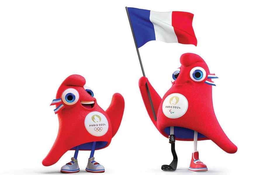 Phryges: The mascots for the Paris 2024 Olympic and Paralympic Games
GW: The mascot was something that we worked on for close to two years. It's something that is merchandise, which is very important commercially for the OCOG and it needs to sell. So, it needs to have that fluffy toy feel because that's how people relate to it. And it also needs to tell a story. The teams at Paris 2024 have been obsessed by the idea of making these Games most inclusive, the most sustainable, and the most gender-neutral in history.
Also read: The inspiring, incredible stories behind India's Paralympic medallists
The tagline that we developed was ‘Games Wide Open’, which was this idea of everyone's welcome to the Games, whether you're able, disabled, wherever you come from, etcetera. So, it was a statement of inclusivity.
The mascots played to that theme, because they tell the story of the French Revolution. It's the spirit of liberty; it's the spirit of change; and at the same time, they’re a bit plump; they look a bit like us; they're not athletes; and they have this personality. So, we tried to achieve that balance between making it a symbol and something we can relate to. Almost a month after the start of the games, they've become an international meme.
Initially, they were criticised by a lot of people, especially the French, who like to be autocritical. But they got popular acclaim during the Games, and became this fun and powerful symbol. It's a really nice way to see how it's evolved. It became something positive, that brought people together.
CT: The mascot is one of the most wanted items of merchandising. During all the previous Games, you have had one mascot, which is different for the Olympics and the Paralympics, for financial aspects. It was a really big challenge to convince everyone to have only one mascot, because they're the same; you can only see the disability [a mascot with a prosthetic leg].
Q. Tell us about the convergence of branding for the Paralympics and the Olympics through the pictograms?
CT: Over the years, when you look at pictograms [developed for the Olympics and Paralympics], you can see a human figure that is more masculine. This year, with the motto ‘Games Wide Open’, we wanted to put sports in the centre of everything. So, when you look at the pictogram, you emphasise the sport, and not any gender. In terms of design, it’s constructed around a geometric form. It’s a badge of honour, that can be proudly worn by everybody.
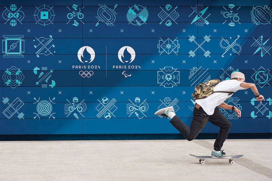 The 47 sports disciplines in the Paris 2024 Olympic programme have their own pictograms, eight of which are also used for the Paralympic sports
Q. How did you design the ‘Look of the Games’? How did you arrive at the colour palette and the graphics?
CT: The choice of colours, in some cases, was dictated by the venues of the events. You cannot use some colours for some sports. For instance, swimming is always in blue, otherwise, any other colour is a distraction for the athletes. It can play with their minds when they are swimming. So, we were able to use some colours and not use some others. Each venue had their own colour palette, but pink was the unifying colour. Pink was also used on the signage.
GW: A lot of the creative work was done with an attempt to keep the legacy of the 1924 Summer Olympics in Paris, while bringing it into the 21st century. It was about Art Deco. It was about Orphism, an artistic movement led by Robert and Sonia Delaunay, which was about movement and pulsing lights. So, that was the inspiration in terms of that colour palette. There's a lot of shading with the colours, and how they bleed into each other and create this hypnotic movement in terms of the geometric breakdown of all the components. So, it's a nod to what was extraordinary in the 1920s.
Also read: India finishes Paralympics with historic tally: Meet the inspiring medallists
Also, part of the choice was to have colours that were completely unexpected, such as pink. I mean, you can post-rationalise pink anywhere you want; you can talk about pierre de taille [a type of stone and a rosé wine from Provence, France); in Hausmann architecture, you can talk about the colour of the Eiffel Tower, which is brownish pink; you can talk about how pink is linked to Paris. But I think a lot of the intention was to showcase to the world something that hadn't been seen before.
The athletic track and field at the Stade de France in Paris were a unique shade of purple; things that hadn't been done before. The organising committee always emphasised: “We need to show something that hasn't been done before. We need to go places that haven't been gone before.” A lot of briefs we received were also about, how we can be bolder, how we can be more unexpected. It was the real theme of these Games.
Q. Were there any challenges? If you had to do it again, would you do it differently?
CT: One of the important things here is that it's the first time that the venues for Olympics and Paralympics are held in the city (Eiffel Tower, Place de la Concorde, Grand Palais). It was a challenge to merge and see everything around that. One of the important tasks was how to ensure proper deployment? For that we developed a 601-page document called the ‘Kit of Parts’ that was given to the deployment companies, and they worked with that. If we have a look at it right now, I don't see any mistake on the rhythm and on the construction that we did on the computer. It's quite remarkable. We can say we did better than the previous Games in terms of inclusivity, in terms of being gender-neutral, among the other topics we discussed earlier. What I hope is that the next Games will be better, because we are always in progress.
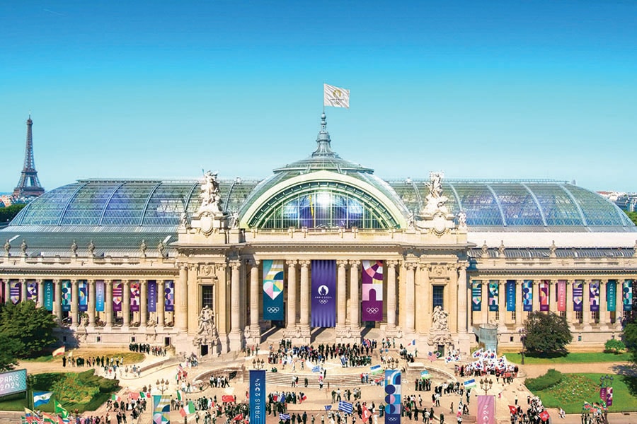 The Grand Palais with its magnificent nave and glass roof was restored to be one of the venues for the Paris 2024 Games
Q. These Olympic Games needed to be the most sustainable. What were the conscious decisions to achieve that?
CT: On the design aspect, we developed the same Look of the Games for the Olympic and Paralympic. What was changed was only the logo. You could remove the rings and put the Agitos [the Paralympic symbol made up of three arcs in red, blue, and green]. It's the same for the signage. and it's the first time as well that you can see a brand block at the top of the signage with the logo of the Paralympics and Olympics and Paris 2024.
So, it helps that you don't have to change the structure, you only have to change the stickers on it for the different venues and sports. This was the design revolution, on how we develop branding assets to help us design at lower costs.
Also read: An eye above the spectacle: Photography at the Olympics 2024
GW: Yes, it looks like nothing once you've done it, but it's actually quite a revolution.
It's been very interesting seeing a lot of the flags and decorations being changed overnight because it was very simple to do. It creates a feeling of a smooth transition between the two Games and a global feeling of Paralympics and Olympics being one event.
It was thought out to be extremely clean, cost-effective, and as sustainable as possible. Naturally, a lot of stuff gets printed, deployed, etc, but one of the obsessions of the organising committee was trying to have the most sustainable Games ever. The only thing that was purposely built for these Games was the Olympic Aquatics Centre (OAC). All the rest was renovation or modification of certain buildings that was planned in terms of future usage.
Q. Were there any logistical nightmares?
GW: We would like to be able to share horror stories, but we don't have that many. The French being French, were saying, it’s going to be a nightmare, it's going to fail. To the contrary, it was extraordinary, smooth sailing. It's not like the people were particularly surprised; there was a lot of pressure, but they delivered.
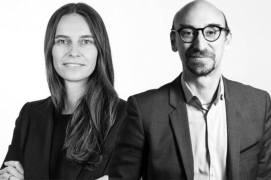 From left: Chloé Thomas, Branding Deputy General Director; Grégoire Weil, Managing Director, W Conran Design
Maybe one of the only things that was a shame is that the Parisian authorities scared Parisians into leaving during the Games because they said, ‘Oh, it's going to be a nightmare, it's going to be really complicated to get around, and you're going to be stuck in your places.’ So, a lot of people did leave, and a lot of people regretted leaving because they saw afterwards that it was such an amazing atmosphere—the way Paris has never seen, this kind of international Tower of Babel with people just happy to be there and to celebrate together. That’s the only misstep. Maybe Parisians could have been the real stakeholders and enjoyed the Games.
Q. Was the team at the agency very involved while the Games were on?
GW: No. Our work ramped down here, by early 2024, simply because our work was the building block for others to work on. Our final pieces of work were sustainability campaigns that were aired in Paris during the Games. Now we're watching TikTok and Instagram and looking at the results more than actual work.
Also read: Parth Jindal and JSW Sports: Building India's Olympics ecosystem
Q. How about the digital engagement? How did people interact with content that was designed by the agency?
CT: The difficulty here is that in terms of branding, you need to create a brand that is going to exist for four years, but online during the Games. We needed to build a community, starting from the beginning of those four years, and build a crescendo for the four weeks of the Games. So, we created what's called ‘Le Club’ and you were able to join the Club newsletter.
And, for example, you could subscribe to Marathon Pour Tous (Marathon for All), [an overnight marathon for the public on the Paris Olympic 42.195 km marathon course]. People who are not athletes could join and run the same road as the marathoners. It was the first time that people could do that. This was a huge success. And you could subscribe through Le Club, gain your bib through your result. During the Games, different channels existed: Olympic and Paralympic app for results, Paris 2024 Tickets app, social media (Instagram and TikTok mainly).
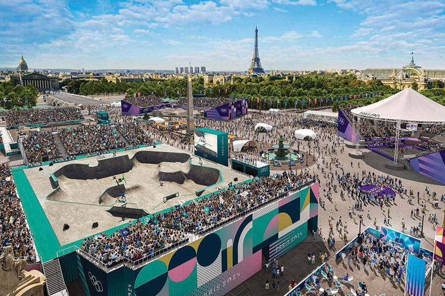 During the Olympic Games, the Place de la Concorde hosted the BMX freestyle, breaking, skateboarding and 3×3 basketball events
During the Games, you also had the screen, and every piece of information regarding the sport that you were going to see, how it works, what does it mean, what are the rules? Everyone was included, not just the people who were going to see the sport. It was around communication and engagement; it was a celebration.
GW: The focus on digital was really about building engagement, and one of the strategic things that they worked on was how you could get the federations, sports clubs, amateur sports, etc, excited and part of the energy of the Games. This started some time ago with the more institutional side reaching out to all these sporting institutions so that they'd be part of this and would energise it. One of the things that really worked during these Games was fan zones that peppered the city. The Club France was one of the zones to be in if you didn't have arena tickets. It showed live screenings of the competitions and host athletes throughout the Games. It was packed full for the duration of the Game, offering a rich array of services and activities that celebrate sport, culture, and international camaraderie for a fee of €5.
Also read: From LA's Rocketman to London's Skyfall: Iconic Olympics openings
People would queue there for 3 or 4 hours in the morning to get tickets to get in later. All of that was built through the digital engagement strategy; our input, naturally, was digital design UI/UX. But a lot of credit goes to the organising committee teams that were able to have that digital, event-based thinking cap on in terms of having that energy all the time.
CT: Right now we see the role that athletes play in the digital aspect. You can see how women’s rugby athlete Ilona Maher jokingly turned the Olympic village into ‘Love Island’ on TikTok; Simone Biles as well had a huge impact. The Norwegian distance swimmer Henrik Christiansen, competing at Paris 2024, gave the “choccy muffin” an “Insane” 11/10 star review on TikTok, and all the chocolate muffins were out of stock. It was crazy. And we are proud because the Phryges on TikTok is huge as well. It's really helped us to see how the community interacts with the role of the athletes and the mascots.
When you compare it with the previous Olympics, without any audience the athletes felt a sense of isolation. The brand platform, all about joy and celebration, just really tapped into that zeitgeist that people wanted to celebrate, wanted to communicate. The brand was joyful and colourful and different, and the athletes were involved in that.
Q. Did the brand design help in achieving what was required from it?
GW: The dream of every organising committee is for the spillover of the Games to become part of the pop culture and to last for more than just a few weeks. We only played a small part; it's what the OCOG has managed to pull off. They made this an event that has this kind of pop culture feel, and it was ‘memed’, it was shared, it was spoofed on TikTok. And that's quite true compared to what happened in Tokyo; they were very clinical Games with empty stadiums; it was about sport performance. Paris has been this popular celebration, and I'd go so far as to say it's made the Olympics cool again.
We feel that after Paris and with the handoff to LA, which is basically the world capital of entertainment, you can tell it feels like a new cycle is being launched where again there's enthusiasm, there's feeling for what the Olympics do and bring. If that's any legacy for Paris 2024, that's quite a big legacy.
Q. Looking ahead to India's bid for 2036, how can it learn from your experience at the Paris Olympics?
GW: There are, naturally, numerous aspects to address, from organisation and communication to logistics. However, if we were to highlight three key factors around brand, we’d focus on the following:1. Settle on a North Star: The Games are a choral masterpiece, involving committees, athletes, governments, federations, artists, and brands. To unite all these elements, it’s essential to establish a clear, guiding vision or a ‘North Star’. Countries hosting the Games face high expectations, and there’s no cutting corners. But beyond meeting those demands, you must choose your focus and innovate and create accordingly. The Games are about breaking records and leaving a legacy. So, it’s critical to consider what will be India’s first? What will India’s Games be remembered for? For Paris 2024, ‘Openness’ was our North Star, which informed everything, from our tagline to the design of the mascot, the pictograms, the opening ceremony, and the venues. What will be India’s guiding principle?
2. Turn clichés on their heads: Every country has a set of clichés associated with it, and India is no exception. While some of these preconceptions might be useful, others may not align with the image you wish to project to the billions of people watching. In nation branding the key is to use the strength of these clichés to your advantage. Through things like humour, subtle references, or bold reinventions, you can turn these familiar associations into something new, into something fresh and relevant and authentic. It’s about leveraging the strong cultural ties people already associate with India, but in a way that surprises and resonates with a global audience.
3. Activate, activate, activate: While conception is important, winning hearts—and the bid itself—requires making the Games more than just a sporting event. It should become part of the broader pop culture. This means going beyond the sports community and engaging with different audiences, creating moments that surprise and delight. Becoming ‘pop’ isn’t something you can declare; it must be actively pursued, with authenticity. Looking back, some of the biggest successes of Paris 2024 were directly tied to creative activations, merchandise, collaborations, and experiences. Our mascots, for example, transcended their role and became icons, winning over even the most critical Parisians. India’s Olympic bid must do the same - create symbols and experiences that resonate with people beyond the stadiums.


